Forms
Part of No-code app testing
Checking mobile and desktop layouts
Check real tasks across narrow and wide no-code app layouts, including zoom, errors, device previews and saved results.
Check the same no-code app tasks on phone, tablet and desktop-sized views, then repeat where browser zoom or device rotation changes the available space. Look for readable information, reachable actions and a clear saved result.
A page that fits in a preview may fail when a browser is zoomed, a phone rotates or a keyboard covers an input. Capture the exact state where information or an action clips, overlaps or becomes unavailable.
Choose tasks before sizes
Start with the routes people need: find a record, read its status, enter or correct information, and confirm a save. Add a long title, a long field value and an error message to fictional test data; these can expose clipping and overlap that short sample labels miss.
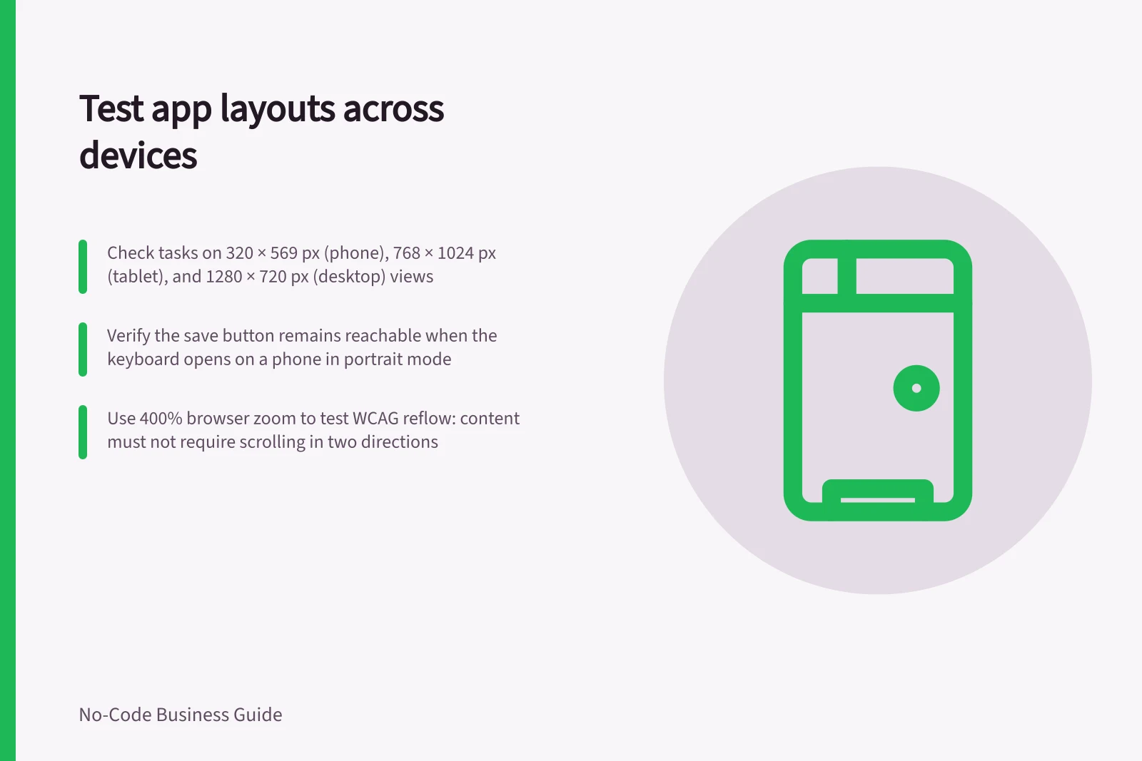
Use these viewport examples: 320 × 569 px and 360 × 640 px for narrow views, 768 × 1024 px for a tablet-sized view, and 1280 × 720 px or 1440 × 900 px for wider desktop views. Check the actual browser or device viewport, not only a full-screen canvas.
Record the app version, device or browser, viewport size, orientation and zoom for each check. A browser window, simulated device view and physical phone or tablet can reveal different faults, so note which one you used.
Follow the full route
At a narrow phone-sized view, open the menu, find the record and complete the task. Check labels, table context and whether the action remains reachable; open and close the keyboard, picker or error message used in that route.
On a physical phone or tablet, repeat the route in portrait and landscape when rotation is allowed. Rotate while a form is open and check whether the current input, keyboard, fixed header or action remains visible.
Repeat at a wider desktop size, such as 1280 × 720 px or 1440 × 900 px, then resize the browser window. Check that related information and its action remain easy to associate.
At 400% browser zoom, use the WCAG reflow benchmark: a starting viewport width of 1280 CSS pixels is equivalent to 320 CSS pixels. Check that vertical content remains available without scrolling in two directions.
WCAG 2.1 Success Criterion 1.4.10 Reflow (Level AA) also gives a 256 CSS pixel height benchmark for horizontally scrolling content, equivalent to a 1024 CSS pixel starting height at 400% zoom. Two-dimensional scrolling is permitted for content that needs that layout for its use or meaning, such as some data tables; individual table cells still need to reflow.
| Task | Narrow view | Wide view | Saved result to inspect |
|---|---|---|---|
| Find a request | Menu and search usable | List and search usable | Correct record opens |
| Correct a field | Label, input and error visible | Field and context clear | Correct value is saved |
| Review a decision | Status and action readable | Status and action associated | Intended record changes |
For each task, record whether labels, data and controls stay visible, and whether the task reaches a clear saved result.
Testing the Full User Route Across Devices
- Start at narrow phone-sized viewOpen menu, find record, complete task
- Check input visibilityOpen and close keyboard, picker, or error message
- Test rotation (if allowed)Repeat in portrait and landscape on physical device
- Resize browser windowCheck association of related info and actions at wider views
- Test 400% zoomEnsure no two-dimensional scrolling; content reflows vertically
WCAG 2.1 Reflow Benchmarks
- Vertical Scrolling Benchmark
- 1280 CSS pixels → 320 CSS pixels at 400% zoom
- Horizontal Scrolling Benchmark
- 1024 CSS pixels → 256 CSS pixels height at 400% zoom
- Two-Dimensional Scrolling Allowed For
- Data tables requiring layout for meaning
Understand preview limits
In Power Apps canvas apps, the maker chooses a phone or tablet canvas. Settings > Display offers portrait or landscape, tablet screen size, aspect-ratio locking and device-rotation support; check the orientations the app is configured to allow.
Microsoft notes that a canvas app running at a different device size or on the web scales to fit. A phone-designed app can look oversized in a large browser window rather than use the extra space for more controls or content, so check it at the sizes where it will be used.
Record a layout fault
Note the task, screen, device or viewport, orientation, zoom, input state and point where work stops. “Save button covered when the keyboard opens on this form” is more useful than “mobile looks wrong”. Add a safe image only if it clarifies the fault.
After a change, repeat the task at the affected size and another relevant size. Record whether the layout now keeps the information and action available.
What to Record When Checking Layouts
- Task being performede.g., Correct a field
- Device or viewport usedPhysical phone, tablet, browser window, or simulated device
- Input stateKeyboard open, form in error state, picker active
- Point where work stopse.g., Save button covered by keyboard