Forms
No-code forms and interfaces
Plan no-code forms, record views and navigation around entry, clear feedback and the next action.
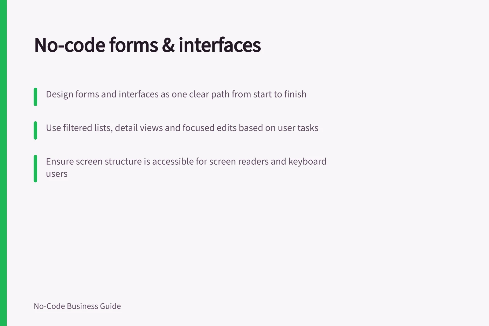
A no-code form lets someone enter or change information. An interface helps them find a record, understand its state and take the next permitted action. Design both as one path: what the person knows at the start, what they must do, and what they need to see afterwards.
Choose a screen for each task
A form may be enough when someone submits information and an established process takes over. Add working views when staff need to return to records, correct them or decide what happens next.
| User need | Useful starting screen | Question to settle |
|---|---|---|
| Enter information | Form | What can this person know now? |
| Find work awaiting action | Filtered list or queue | Which records belong here? |
| Understand one record | Detail view | Which facts and status matter? |
| Make a change | Focused edit or action | How will the result be confirmed? |
These are design choices, not fixed product categories. Sketch the route between screens before configuring them.
Make screen structure accessible
Accessible forms are easier to use for everyone, including people with disabilities. A clear structure and instructions can help people understand what a screen asks them to do, while consistent feedback can make the next step easier to identify.
Screen readers rely on a screen’s structure to help users understand its content and move through it. Keep the information needed to complete a task available in that structure, rather than relying only on visual placement or styling.
Fit the form to the moment of entry
Suppose a staff member reports a stock discrepancy. They may know the item, location, counted quantity and what they observed. They may not know whether an adjustment should be approved. Put that decision in the reviewer's task rather than requiring the reporter to guess.
Give fields visible, specific labels. Group related inputs and explain required fields and formats where they are needed. Placeholder text that disappears during typing should not carry the only instruction. If an answer reveals another question, check what happens to that question's value when the first answer changes.
For a long form, use steps that follow the task and show progress. Make clear whether moving to another step stores a draft or merely changes the screen; that behaviour depends on the configured builder.
Make multi-step hand-offs predictable
When a task spans several screens, divide it into logical groups and repeat any overall instructions on each step. Mark optional stages clearly and let users skip them where possible, so they can tell which parts of the route are necessary.
Tell people how many steps remain and where they are in the sequence. If users can return to completed steps, preserve what they have already entered so reviewing an earlier answer does not require starting that work again.
Explain the result of submission
Treat correction, confirmed completion and an uncertain outcome differently. Identify an input the user can fix. After a confirmed write, show what was recorded and a useful route to it. If confirmation is missing, give the user a way to check before submitting again.
Some apps queue changes locally before sending them to the data source. A message saying a record was saved to the shared source must reflect that distinction.
Field feedback also does not establish that every write route enforces the same rule. Check relevant form, action, import and integration paths in the chosen app and data source.
Make feedback easy to act on
When errors occur, a summary at the top of the screen can help people see that something needs attention before they work through the form again. Give the summary a clear heading, name the affected input, explain how to correct it and provide a way to reach that input directly.
Keep notifications concise and clear. A dialog can draw attention to a change that might otherwise be missed, but it is more disruptive than other feedback; use it when that prominence is useful, and ensure users can operate it with a keyboard.
Keep the working interface oriented around action
Give frequent tasks recognisable destinations, such as work awaiting review, records a person may inspect and a route to create an entry. Use task names when table names would be unclear. On a record view, show its identity, current state and available next action.
Choose a predictable destination after an edit: the updated record may help someone confirm a change, while a queue may suit someone processing several items. If they leave an unfinished form, make clear whether their entries remain, were discarded or await submission.
Menu visibility is not record permission. Define and check who can retrieve or change records through the app's data and action rules.
Check the complete route
With fictional records, follow the path from the entry screen through a form, its feedback and the resulting record. Then follow the next person's action. Compare the displayed result with the stored record and check the route on the devices staff use.
In this guide
- Designing a form around the user's taskChoose form fields, order and instructions from what a user knows and needs to finish at the moment of entry.
- Adding validation before saving a recordDefine form rules, show useful errors and check which save paths enforce validation in a no-code app.
- Creating clear navigation in an internal appOrganise an internal app around frequent tasks, clear destinations and predictable routes after record actions.