Forms
Part of No-code forms and interfaces
Creating clear navigation in an internal app
Organise an internal app around frequent tasks, clear destinations and predictable routes after record actions.
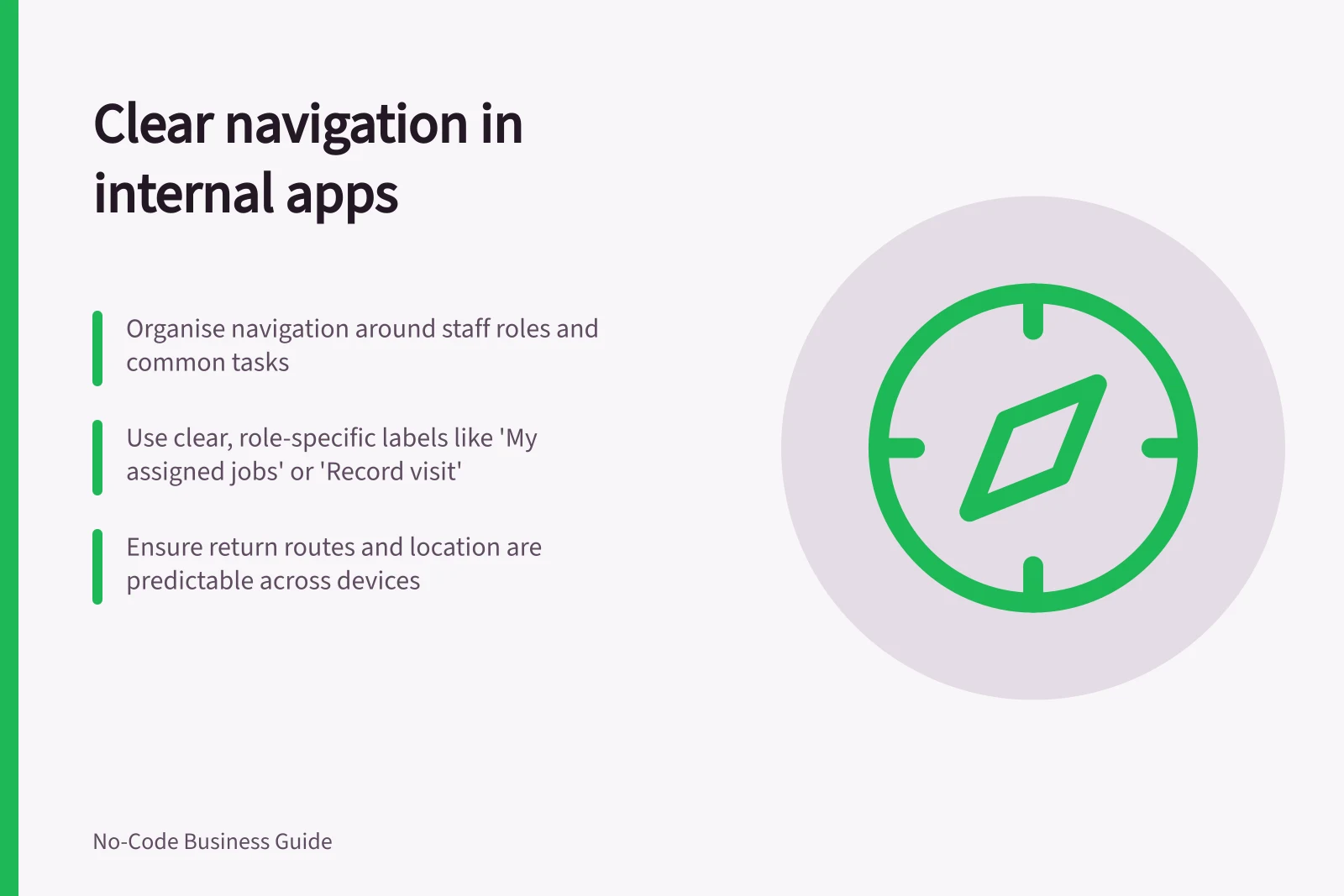
Organise an internal app's navigation around the jobs staff return to. From each list or record, make the next action and the route back clear. People should know where they are and whether leaving a screen will affect unfinished work.
Name destinations for the work
In a hypothetical facilities app, a coordinator might use “Items to review”, “All jobs” and “New job”. A technician might use “My assigned jobs” and “Record visit”. These are examples, not a prescribed menu. Use the words staff use rather than an internal table name when the two differ.
Keep main navigation for destinations people need repeatedly. Place less common record actions on the detail view near the state and facts needed for the decision. A work list should help someone recognise the right record; the detail view should identify it clearly.
| From | To | What should be clear |
|---|---|---|
| Main navigation | Work list | Which work is shown and whose it is |
| Work list | Record detail | Which record was opened and its state |
| Record detail | Edit or action | What the action will change |
| Action result | Updated record or list | Whether the change completed and where to go next |
Navigation clarity across user roles
- Facilities Coordinator
- Main menu: 'Items to review', 'All jobs', 'New job'
- Technician
- Main menu: 'My assigned jobs', 'Record visit'
- Best practice
- Use real team language, not database names (e.g., avoid 'tbl_work_orders')
Make location and return routes predictable
Keep menu wording and order consistent across screen sizes. Mark the current destination visually and, where the builder supports it, in a way assistive technology can identify. Give icons a usable text name when their meaning would otherwise be unclear.
Choose the destination after each action. An updated record can help someone confirm an edit; returning to a queue may suit a person processing several items. If someone leaves an unfinished form, establish whether entries remain, are discarded or require confirmation. Screen navigation alone should not be presented as a completed data write.
In Power Apps canvas apps, Navigate and Back change the displayed screen. Those functions alone do not submit a form, although other configured behaviour can run during a screen change. Check the app's actual write and access rules.
Using `Navigate` and `Back` in Power Apps
- Pros
- Changes screen display instantly; supports consistent navigation flow across devices
- Cons
- Does not automatically submit form data; requires explicit configuration for data write
Follow each role's route
For each role, sketch a path from opening the app to finishing a task. Include an empty queue, an error after an attempted save and a return from a record view. At each screen ask: “Where am I?”, “What can I do here?” and “How do I get back?”
With fictional records and intended user accounts, check menu and direct-record routes where the product permits them. A hidden destination is not denied access; record permissions need their own check. Repeat the navigation review on the devices staff use, since available space can change how a menu appears.
Key questions to ask at each screen
- Where am I?Clear visual indicator of current screen and role-specific context
- What can I do here?Only actions relevant to current role and record state are visible
- How do I get back?Accessible 'Back' button or breadcrumb trail; return path is predictable